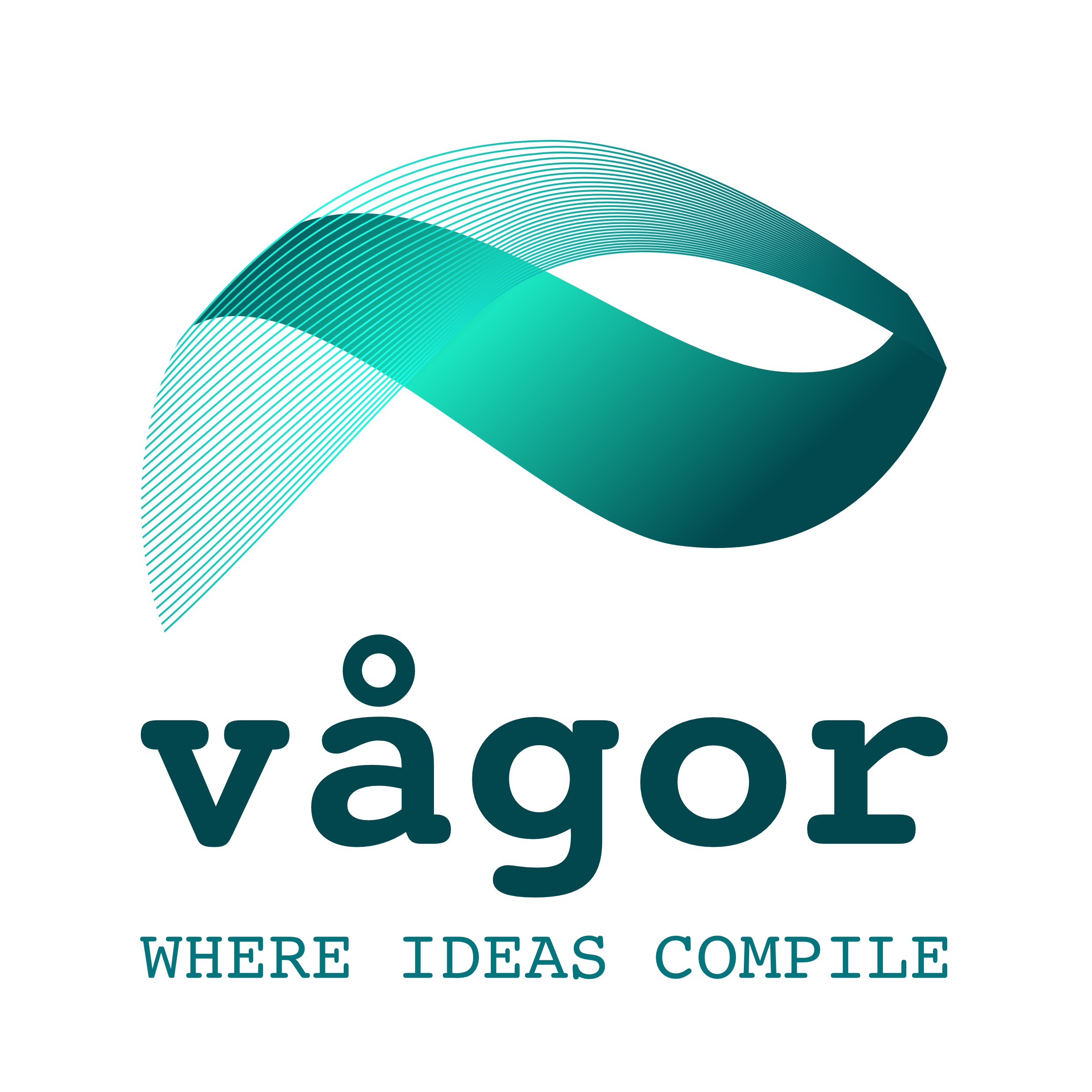
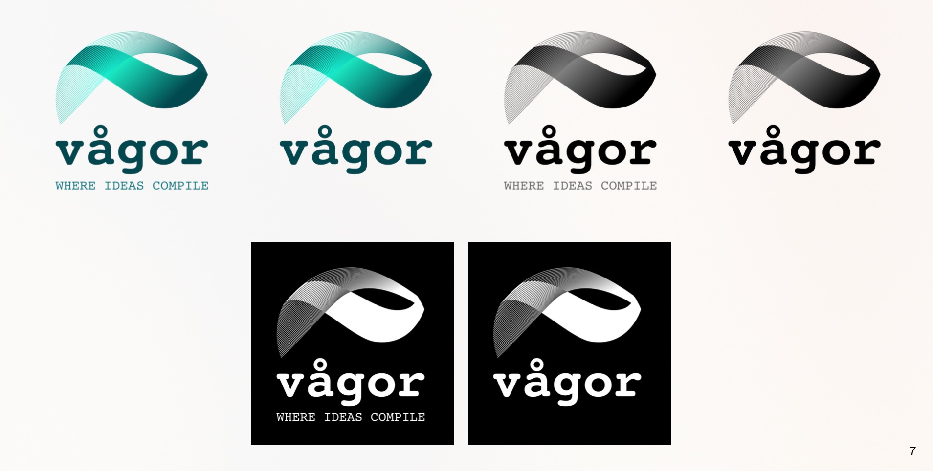
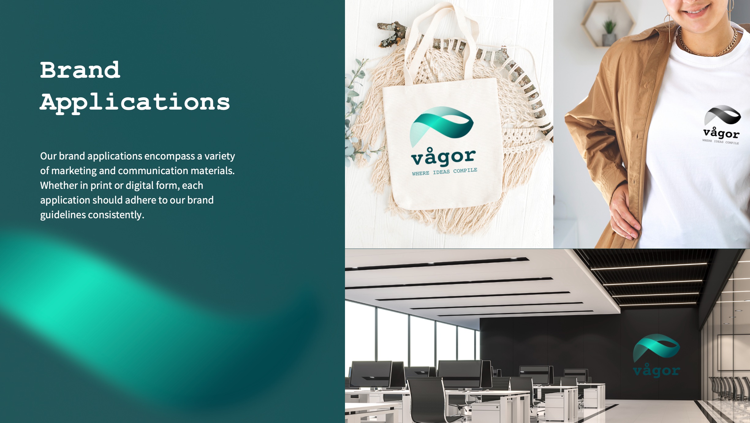
Vågor came to me with an established typographic direction using Courier New. From there, I developed a visual identity around the meaning of the name, Vågor, “waves” in Swedish.
Rather than simply illustrating water, I used the movement of a wave as a metaphor for problem solving. Different elements come together, move forward and find a smooth, effective solution.
The identity combines translucent blues, turquoise and hints of green, inspired by the water surrounding the company’s office. Stronger, darker tones add weight and confidence, balancing the lighter, more fluid palette.
The result is a flexible visual language that works beyond the logo, giving Vågor a distinctive identity across digital, print and brand communications.